A familiar place.
A thoughtful identity.
Brand guide · Dignity Living Spaces
Warm palette revision / October 2026
 A home for
every chapter.
An identity rooted in the feeling of home: warm, capable, and personal. Made for a business that helps people adapt their space without losing what makes it theirs.
Home is personal.
So is the plan.
Our foundation
We help you make home safer today and easier to live in for years to come.
Dignity Living Spaces brings practical improvements and longer-term planning together. A few changes now can become part of a more considered plan as needs evolve.
Welcome homeowners and family members equally. Recognize both the desire for independence and the wish to help someone you love. Keep the homeowner’s preferences central to every decision.
Personal agency
Listen to the routines and priorities that make each home different.
Practical reassurance
Give people clear choices and manageable next steps.
Continuity
Keep one plan in view, from a small improvement to a larger remodel.
An open door.
A continuing story.
The identity
The doorway symbol expresses welcome, familiar surroundings, and a path forward. Its continuous return brings the idea of adapting a home into one compact mark.
The serif wordmark adds a human, established character. The small, clear “Living Spaces” line keeps the business grounded in the home.




Give it breathing room.
Use the full logo at a minimum of 180 px wide on screen or 45 mm in print. Use the symbol alone at 24 px wide or larger when the full name already appears nearby.
Keep every part together and scale proportionally. Do not stretch, rotate, add a shadow, outline, or rearrange the artwork. Do not place it over busy photography.
The SVG wordmarks are outlined for reliable reproduction. Keep the supplied colors; use the black version when one-color reproduction requires it.
A room’s warmth.
A little unexpected.
Color palette
Plum gives the identity its depth. Ivory and Rose keep the home feeling warm and familiar. Soft Apricot and Clay bring warmth to selected details, with Sand for larger quiet surfaces.
Plum
#4A303APrimary ink, logo, buttons, deep panels.
Ivory
#FBF7F1Everyday canvas and light text.
Rose
#E9DCD5A warm opening and editorial moments.
Apricot
#E6BFA8Small highlights and purposeful emphasis.
Clay
#9A4F3BSecondary accent, used sparingly.
Supporting colors: Sand #F0E2D4 for the planner and larger quiet sections; Muted #6B5954 for secondary copy on Ivory; Line #D5C4BB for decorative dividers. Line is not a text color or the sole indicator of a form boundary.
Color balance: let Ivory lead, then Plum and Rose. Keep Apricot and Clay as accents. Use Sand for generous background areas. This revised palette excludes green; avoid adding unrelated accent colors.
| Foreground / background | Contrast | Use |
|---|---|---|
| Plum / Ivory | 11.08:1 | All text sizes |
| Plum / Rose | 8.82:1 | All text sizes |
| Plum / Apricot | 6.98:1 | All text sizes |
| Plum / Sand | 9.31:1 | All text sizes |
| Ivory / Plum | 11.08:1 | All text sizes |
| Clay / Ivory | 5.53:1 | All text sizes |
| Muted / Ivory | 6.18:1 | Secondary copy |
Ratios calculated from the listed sRGB colors. Other combinations must be checked. Apricot, Rose, and Ivory are backgrounds, not light text on one another.
Quiet character.
Every word clear.
Typography
Newsreader
Headlines & editorial emphasis
Regular to Medium · 400–500
Even more yours.Aa Bb Cc Dd Ee Ff Gg Hh Ii Jj Kk Ll Mm
0123456789 & ! ?
Public Sans
Body, navigation & controls
Regular to Semibold · 400–600
Thoughtful changes can make familiar routines feel easier. Start with what matters most to you.
Aa Bb Cc Dd Ee Ff Gg Hh Ii Jj Kk Ll Mm0123456789 & ! ?
Type should welcome the reader.
Use short, sentence-case headlines. Let italics emphasize an occasional phrase. Keep body copy comfortably sized: 16–20 px, with about 1.6 line-height and a readable line length.
Practical hierarchy
Display: 56–96 px desktop, 44–64 px mobile. Section headings: 36–60 px. Body: 16–20 px. Small supporting text: 14–16 px. Adapt fluidly to the viewport; avoid cramped fixed sizes.
Both families are self-hosted and supplied under the SIL Open Font License: Newsreader license · Public Sans license. Keep the license files with redistributed fonts.
Speak to the person.
Make the next step clear.
Voice & message
Warm, capable, and specific.
Our voice makes space for people to make their own decisions. Explain useful changes in everyday language. Reassure through a clear process, not promises no service can make.
| Say this | Avoid this | Why |
|---|---|---|
| “Start with the changes that matter most to you.” | “Your home is dangerous.” | Lead with choice, not fear. |
| “A plan for today, with room to adapt tomorrow.” | “Never leave your home again.” | Support the goal without guaranteeing an outcome. |
| “Grab bars, brighter lighting, and clearer pathways.” | “Comprehensive senior safety solutions.” | Make the work concrete. |
| “Bring family into the conversation if you’d like.” | “We know what’s best for your parents.” | Keep the homeowner’s agency central. |
Only publish verified facts about pricing, coverage, licenses, insurance, certifications, project experience, and partnerships. Never use “fall-proof,” “guaranteed independence,” or invented testimonials.
Show a home.
Let life be the point.
Photography & art direction
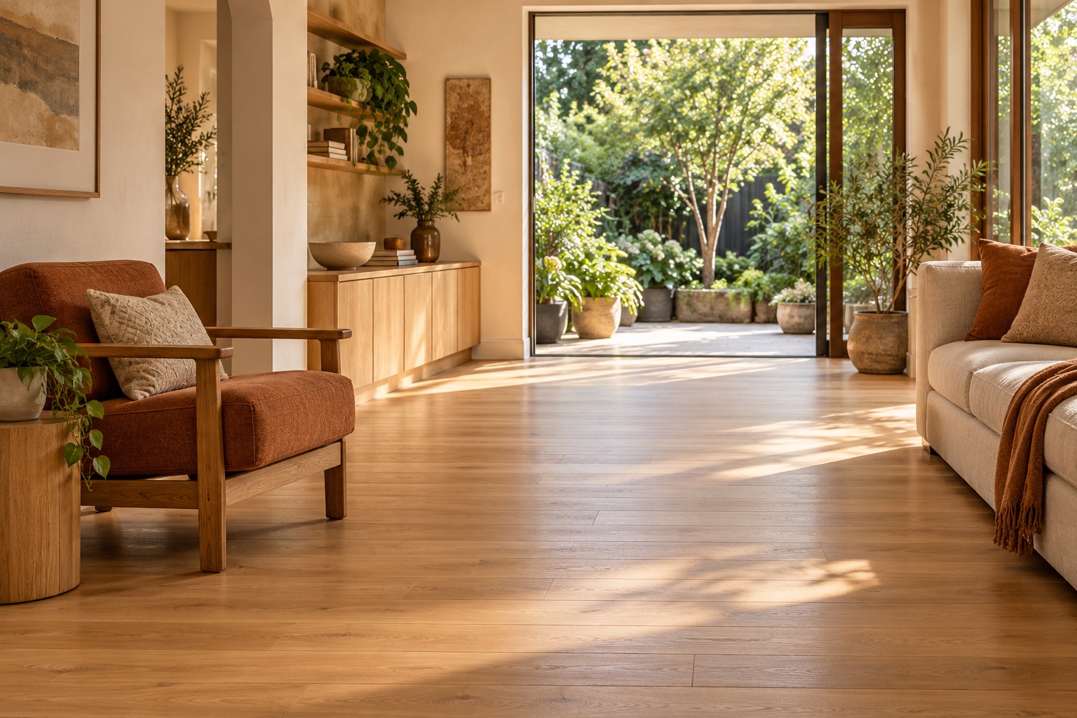
Look for
Natural light. Human scale. Clear circulation. Familiar materials. Details that quietly show how a home works. When photographing people, show their interests, routines, and choices.
Leave out
Hospital imagery, exaggerated frailty, staged distress, inaccessible features presented as solutions, or interiors so grand that the service feels out of reach.
Keep the story honest
Label illustrative imagery. Obtain permission for real customer photography. Use actual, documented project details before making before-and-after claims.
Recognizable,
wherever home leads.
Example applications
A home for
every chapter.
Your home.
Your priorities.
A plan for easier everyday living.
Home visit notesLayout studies only. Add real contact details, project information, and any required business disclosures before producing materials.
Consideration is
part of the design.
Use comfortably sized text, strong contrast, familiar controls, and generous targets. Give every image a useful alternative when it carries meaning. Support keyboard access, browser zoom, and reduced motion.
For the website, make focus visible, label every form field, and keep essential information available without animation. Do not use color alone to identify a state or error.
These are design requirements, not a claim of independently certified accessibility. Test the finished experience with its real content and users.
Before this identity goes live.
Dignity Living Spaces is the requested brand for this concept. Confirm the business name and domain, service area, launch services, contact details, credentials, and operational process before publication. The current local homepage does not send inquiries or book appointments.
Read the research and launch notes